From Scrape to Map: A Tableau Data Mapping Tutorial
The following is a tutorial that will walk you through the steps from scraping a list of NPR stations on Wikipedia, and putting them into an interactive map in Tableau.
Tools We Will Use
Google Sheets
Tableau (download)
Step One: Scrape
Visit the following list of NPR stations on Wikipedia.
We are going to use Google Sheets as a rudimentary scraping engine.
Create a new Google spreadsheet.
Put your cursor in Cell A1 and then copy and paste the following into the formula bar:
=IMPORTHTML("https://en.wikipedia.org/wiki/List_of_NPR_stations", "table", 2)
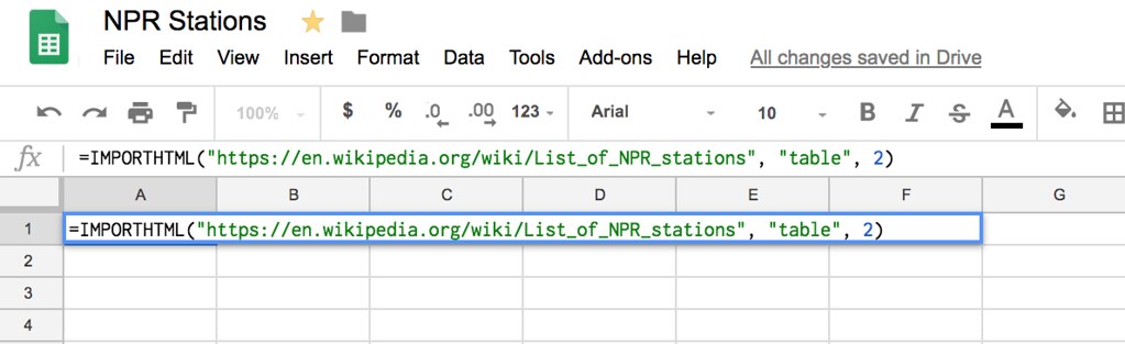
Hit Return and you should see something like this:
That high, whistling sound you hear is countless hours of your life being given back to you.
Step Two: Creating A Sheet We Can Clean Up
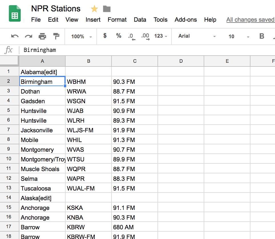
For our next step, we are going to have to copy the values in our spreadsheet into a new tab. We won’t be able to do any cleanup on our existing sheet, because it is all connected to the page on Wikipedia being imported by the IMPORTHTML function.
Select columns A, B, and C and then press Ctrl+C. Create a new sheet by pressing the Add Sheet button (a plus sign in the lower left). Visit the new sheet and place your cursor in cell A1. Then click Edit > Paste Special > Paste Values Only.
Now, we have the same data, only in an editable form. Time for a little cleanup.
Step Three: A Little Cleanup
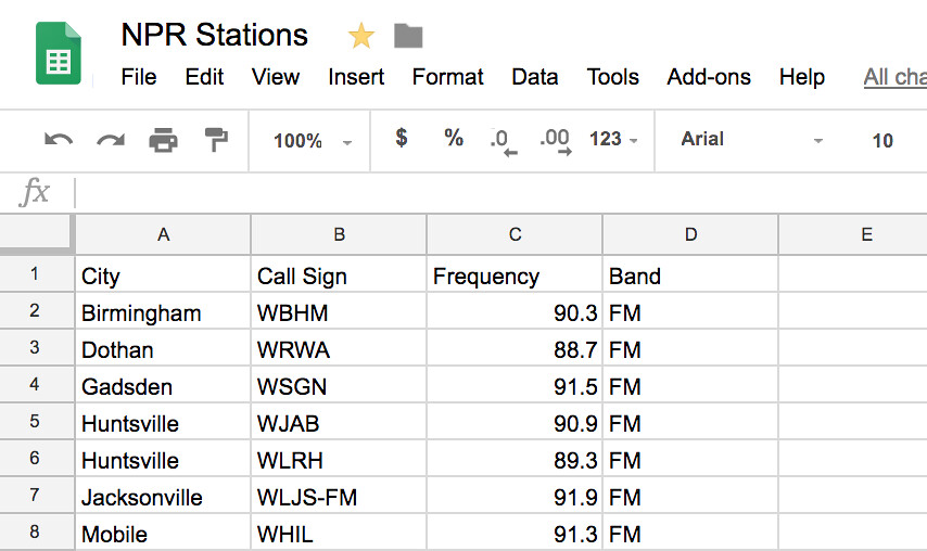
Now, we have both the frequency and the band in column C. It would be better for us if those were in two separate columns.
Select Column C, and then choose Data > Split Text to Columns. You will see a dialog box that allows you to choose the separator. It defaults to ‘Detect automatically.’ You don’t want that. Click on it and choose ‘Space.’
You’ll now see that you have a column for the frequency and one for the band (FM or AM).
Give each of your columns a useful heading. I used City, Call Sign, Frequency, and Band. Your sheet should now look like this:
Connecting Your Data to Tableau
Cleaned Data NPR Stations
You may have noticed by now that your sheet does not actually contain ALL of the NPR stations. In fact, the data is contained in a number of different <table> elements in the original Wikipedia page. So in order to import the entire list, you would need to run the IMPORTHTML function several times and stitch the data together. I can tell you’re a busy person, so I’ve done this for you. Visit this Google sheet NPR Stations and click File > Download As > Microsoft Excel. It doesn’t matter for the purposes of this tutorial whether or not you have Excel on your machine, since we’re going to be using Tableau next.
Next, open Tableau. You will see a screen like this:
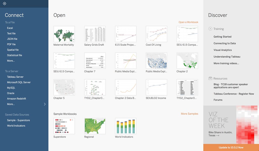
On the left, under Connect, click Excel, and select the Excel spreadsheet you just downloaded. Then, under sheets, drag the sheet titled Stations Flat into the data area. It will look like this when you are done:
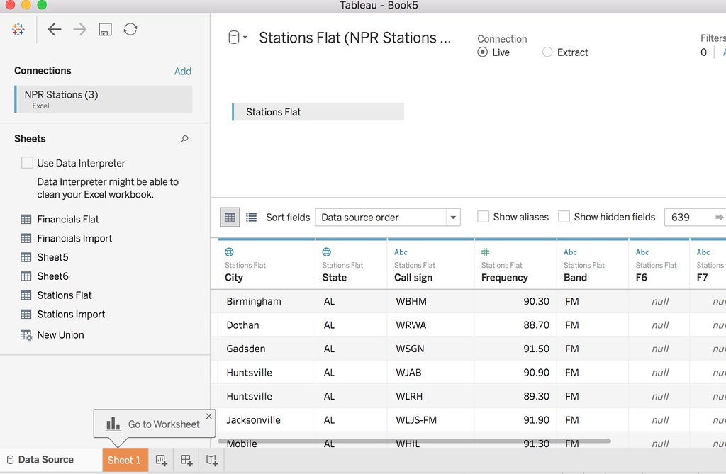
Building Your Visualization
Notice the tooltip in the lower left that says “Go To Worksheet”? Click the highlighted tab, “Sheet 1.” You will see the screen where you will build your Tableau data visualization.
Tableau automatically sorts your source data into two types: Dimensions (things like names, or place names) and Measures (typically numbers).
To begin, click and drag the City measure onto the Detail box under Marks.
WHOA!
Suddenly you’ll have something that looks like this:
;
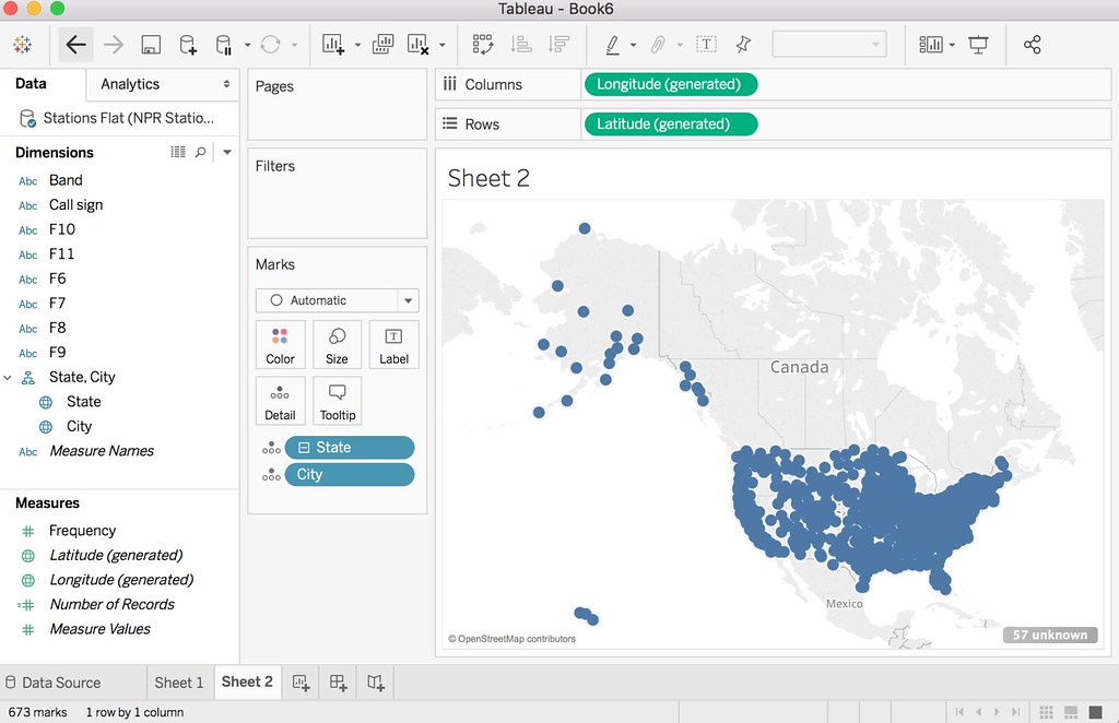
Tableau is pretty amazing, huh?
Filtering and User Controls
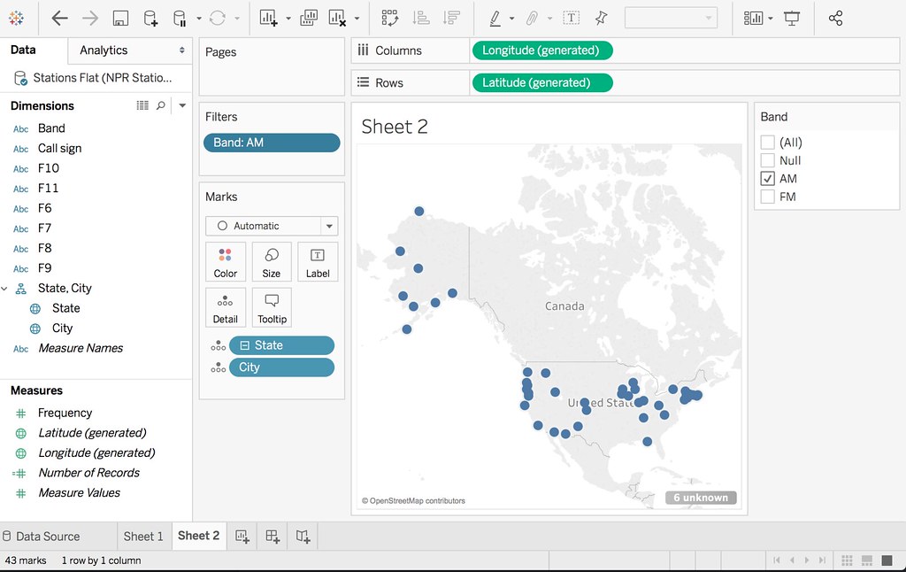
Dots on a map are cool, but there are ways we can make our map more expressive through filtering.
Drag the Band dimension into the Filter box. Choose AM and FM.
Now, click on the blue Band ‘pill’ in the filter box. (Pills are what Tableau calls dimensions that are in use, due to their shape. Pills can be in the Filter box, in Marks, or above on the Columns and Rows shelves).
When you click on it, choose ‘Show Filter.’
Now you’ll see a clickable control on the right. This will allow you to show or not show dots based on whether they are AM or FM stations. Go ahead and uncheck the FM checkbox.
Adding Color for Readability
When we show both AM and FM stations, our map doesn’t tell the viewer much except ‘there’s a station here.’ Let’s begin to use color to make our map more expressive and readable at a glance.
Drag the Band Measure onto Color in the Marks box. You’ll notice that the dots change color based on AM and FM. Click on the Color box and then click ‘Edit Color.’ Make FM blue and AM yellow by clicking first the name of the dimension (AM or FM) and then the color.
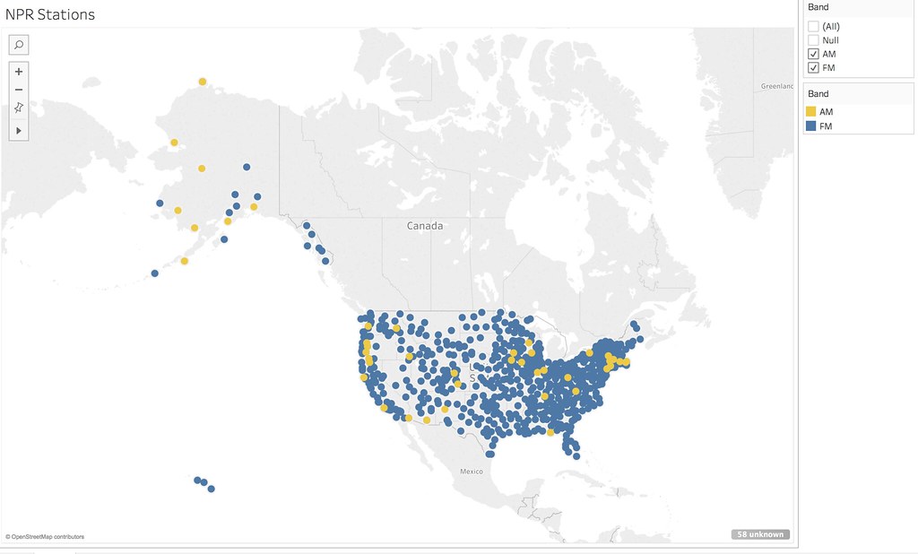
Enjoy your map!
Getting Your Map on the Web
Choose Server > Tableau Public > Save to Tableau Public.
You will need a Tableau Public account (it’s free).
If you get an error message saying that you need a data extract, switch to the Data Pane. Look in the upper right corner and you will see two radio buttons – one that says Live, and another that says Extract. Click the Extract button and try again.
Tableau Public will open in a browser. Edit any information you want to go with your visualization and hit Save. Then, in the lower left of the visualization, you will see an icon that looks like a sideways letter “V.” This is the Share icon. Using that you will be able to get an embed code to embed your visualization in a webpage.
More: Making a Cloropleth Map
Dataset: Maternal Mortality Statistics, World Health Organization
Even More: Animating A Map
The dataset above has maternal mortality statistics over a number of years. What if you could animate the map, to show the changes over time? Good news…you can! Check out this video.
Cleaning Up Columns
Want to make a table of stations, but get an annoying column of “ABC” values? Here’s how to fix that
Additional resources
Tableau Your Data is not cheap, but it’s the best book by far that I have read on the subject. I refer to it frequently. I recommend getting the paperback over the electronic version.
Tableau training videos Tableau itself is a great learning resource and maintains a huge library of videos and tips. Highly recommended.
Did you encounter problems with this tutorial, or have questions?
Please file an issue on this repository!